
Typography is the cornerstone of graphic design, a subtle yet powerful tool that shapes how information is communicated. It is the art and technique of arranging type to make written language not only legible and readable but also visually appealing when displayed. In this, we will explore the depths of typography in graphic design, unraveling its history, dissecting the anatomy of letterforms, and uncovering the psychology behind fonts.
We will also discuss how to choose the right font, create a typographic hierarchy, enhance visual appeal, and adapt typography to various media, including web design, print design, logo design, social media design, and video and motion graphics. Along the way, we’ll identify common typography mistakes to avoid and delve into best practices that will empower you to create stunning and effective designs.
What is Typography?

Typography is not just about selecting a font; it’s the art of crafting the visual language of your content. It encompasses a multitude of elements, each playing a crucial role in the overall design aesthetic and readability. To master typography, you must first grasp these key concepts:
Font:
Fonts are the foundation of typography, representing the unique styles and designs of characters within a typeface.
Font Family:
A font family is a collection of related fonts with varying styles (e.g., regular, bold, italic) but consistent design elements.
Font Weight:
The font weight refers to the thickness or boldness of a font, influencing the emotional and visual impact of your text.
Font Size:
The size of the font is pivotal for readability and visual impact. Choosing the right size is a balancing act between aesthetics and practicality.
Kerning:
Kerning involves adjusting the spacing between individual characters to ensure even visual spacing, enhancing legibility.
Leading:
Leading is the vertical space between lines of text. It affects the overall look of a paragraph and plays a significant role in readability.
Tracking:
Tracking, also known as letter-spacing, refers to the uniform spacing between characters. Adjusting tracking can impact the overall density and readability of the text.
Hierarchy:
Typographic hierarchy utilizes different fonts, sizes, and weights to guide the reader’s eye and emphasize essential information.
The History of Typography
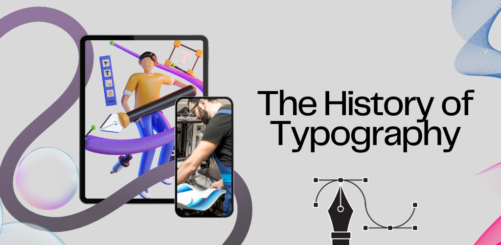
Before we delve into the practical aspects of typography, let’s take a step back in time to understand its rich history. Typography has evolved from early calligraphy and printing techniques to the digital era, shaping the diverse landscape of typefaces we have today.
The Anatomy of a Letterform
To truly master typography, one must understand the anatomy of a letterform. A letterform consists of various parts, each with its name and significance in design.
The Different Types of Typefaces

Typography boasts an array of typeface categories, each with its unique style and purpose. Some of the most common typefaces include:
Serif:
Serif typefaces are known for their small decorative lines or “serifs” at the end of each stroke. They often convey a sense of tradition, formality, and elegance. Examples of serif fonts include Times New Roman and Garamond.
Sans-serif:
Sans-serif fonts lack the serifs, offering a more modern, clean, and minimalist appearance. Helvetica and Arial are popular sans-serif typefaces.
Display:
Display typefaces are bold, eye-catching, and often used for headlines or logos. They come in a wide range of styles, from playful to sophisticated.
Script:
Script fonts mimic cursive handwriting, adding a personal touch to designs. They are commonly used for invitations, greeting cards, or other decorative elements.
Decorative:
Decorative fonts can be highly stylized and are best used sparingly for special design accents. They can be elaborate and unique, making them ideal for logos or artistic projects.
The Psychology of Typography

Typography is not just about aesthetics; it’s also about psychology. The choice of font can evoke specific emotions, establish a brand identity, and even convey cultural or historical references. Understanding the psychological aspects of typography is crucial for effective design.
Choosing the Right Font
Selecting the right font for your project is a pivotal decision. It should align with your brand’s message and identity while ensuring legibility and accessibility.
How to Choose a Font That Fits Your Brand and Message
Your choice of font should reflect the essence of your brand and the message you wish to convey. For example, a law firm might opt for a traditional serif font to convey professionalism, while a trendy cafe might choose a playful and decorative font to establish a laid-back atmosphere.
How to Choose a Font That is Readable and Accessible
Legibility is paramount in typography. If your audience can’t read your text comfortably, your message is lost. Factors like font size, spacing, and contrast are essential for readability.
How to Pair Fonts Effectively
Font pairing is an art in itself. It involves selecting two or more fonts that complement each other harmoniously. Combining a bold, attention-grabbing font with a simple, readable one can create a balanced and visually appealing design.
Common Font Pairing Mistakes to Avoid
While font pairing offers endless creative possibilities, there are some common mistakes to watch out for. Mixing fonts that are too similar or overly complex can lead to confusion and an unprofessional look.
Where to Find High-Quality Fonts
The internet offers a treasure trove of free and paid fonts, but not all are created equal. We explore trusted sources where you can find high-quality fonts for your design projects.
Using Typography to Create Hierarchy
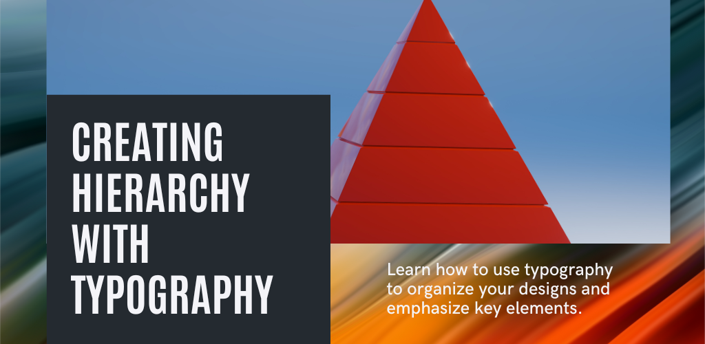
Typographic hierarchy is a fundamental design principle. It enables you to guide the reader’s eye and emphasize the most important information within your content.
What is Typographic Hierarchy?
Typographic hierarchy involves using different font attributes (size, weight, style) to establish a visual order of importance within your text.
Why is Typographic Hierarchy Important?
Hierarchy helps readers navigate your content effectively. It highlights key messages and aids comprehension, making your design more user-friendly.
The Different Levels of Typographic Hierarchy
We’ll delve into the various levels of typographic hierarchy, from primary headings to body text, and discuss the roles they play in your design.
How to Use Typographic Hierarchy to Guide the Reader’s Eye
By strategically employing typographic hierarchy, you can control where your audience’s attention goes. This is essential for ensuring they grasp the most critical information.
Examples of Effective Typographic Hierarchy in Graphic Design
We’ll showcase real-world examples where designers have used typographic hierarchy to create engaging and informative designs.
Using Typography to Enhance Visual Appeal
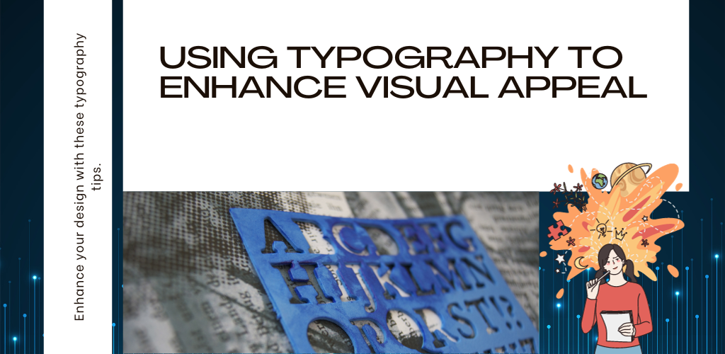
Typography isn’t solely about conveying information; it’s a powerful tool for creating visually appealing designs.
How to Use Color, Alignment, and Spacing to Make Your Text More Visually Appealing
We’ll explore how color, alignment, and spacing can be used to enhance the aesthetics of your text.
Creative Typography Techniques
For those looking to push the boundaries of design, we’ll delve into creative techniques such as drop shadows, letter spacing, overlapping text, and text effects.
How to Use Typography to Create a Mood or Atmosphere in Your Design
Typography can set the mood for your design. Whether you want to evoke a sense of nostalgia or create a futuristic atmosphere, font choice and styling can achieve this.
Examples of Visually Appealing Typography in Graphic Design
We’ll showcase examples of how typography has been used to create visually stunning and impactful designs.
Typography for Specific Media
The Typography is not one-size-fits-all; it must be adapted to suit the medium in which it’s used.
Typography for Web Design
Web typography comes with its own set of challenges and best practices. We’ll discuss how to optimize typography for websites, focusing on responsive design and web fonts.
Typography for Print Design
Print design requires meticulous attention to detail, as the final output is fixed. We’ll explore considerations for typography in brochures, magazines, and other print media.
Typography for Logo Design
Your brand’s logo is often the first impression people have of your company. Typography plays a significant role in logo design, and we’ll provide tips for creating a memorable logo.
Typography for Social Media Design
With the rise of social media, compelling typography is crucial for grabbing users’ attention. We’ll discuss how to make your social media graphics stand out.
Typography for Video and Motion Graphics
In the dynamic world of video and motion graphics, typography takes on a new dimension. We’ll explore how to integrate text effectively into moving visuals.
Common Typography Mistakes to Avoid
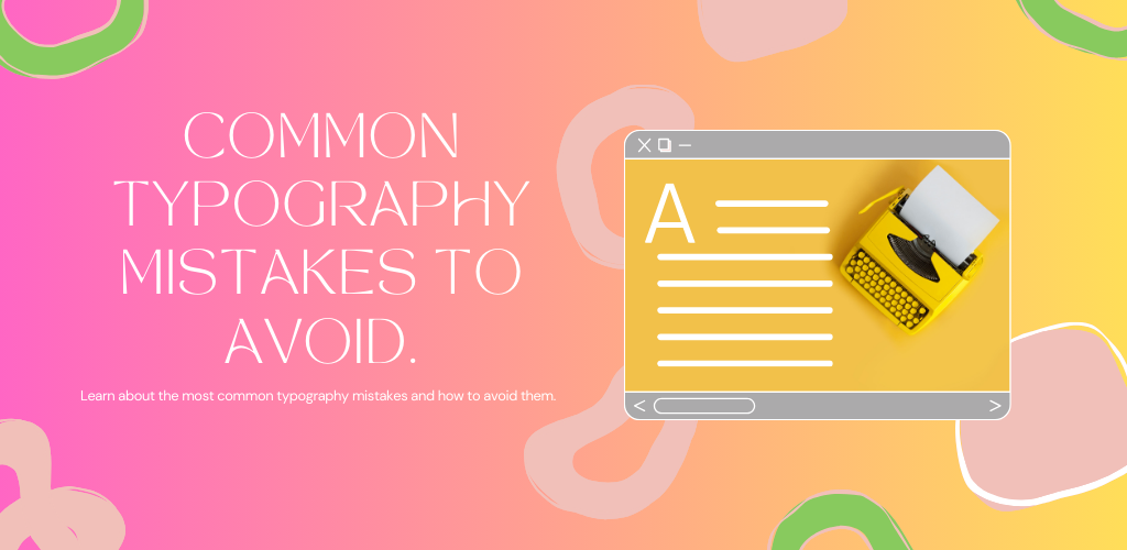
While understanding best practices is essential, it’s equally important to be aware of common mistakes that can hinder your design.
Using Too Many Different Fonts
Overloading your design with numerous fonts can lead to confusion and a lack of visual cohesion.
Using Fonts That Are Too Difficult to Read
Sometimes, artistic fonts may sacrifice readability. We’ll discuss when it’s appropriate to prioritize legibility over aesthetics.
Not Using Enough Contrast Between Text and Background
Low contrast between text and background can strain the reader’s eyes and impede comprehension.
Not Using Enough White Space
White space is your friend in design. Crowding text can make your content overwhelming and hard to digest.
Justifying Body Text
While justified text looks tidy, it can lead to uneven spacing between words. We’ll explain when and how to use justification effectively.
Using All Caps for Body Text
ALL CAPS TEXT CAN BE DIFFICULT TO READ, AND IT CAN CONVEY SHOUTING. We’ll explore when it’s appropriate to use all caps and when it’s best to avoid it.
Typography Best Practices
To wrap up our exploration of typography in graphic design, we’ll summarize some key best practices that will help you create beautiful, effective designs.
Use a Limited Number of Fonts (Two or Three Is Ideal)
Simplicity often leads to elegance in design. Restricting your font choices can create a clean and coherent visual identity.
Choose Fonts That Are Readable and Accessible
Always prioritize legibility and accessibility. Your message must be easy to consume.
Use Enough Contrast Between Text and Background
Ensure your text stands out and is easy to read by using sufficient contrast.
Use Enough White Space
White space provides visual breathing room, enhancing the overall look and readability of your design.
Align Your Text to the Left or Center (Avoid Justifying Body Text)
Left-aligned or centered text is generally more readable and aesthetically pleasing than justified text.
Use All Caps for Headings and Subtitles Only
Reserve all caps for elements where emphasis is needed, like headings or subheadings.
Proofread Your Text Carefully
Typos and grammatical errors can diminish the professionalism of your design. Always proofread your text before finalizing your project.
Read also: Information Architecture Vs Sitemap
Conclusion
In conclusion, typography is a multifaceted and essential element of graphic design. It is not merely the selection of fonts, but a thoughtful craft that can enhance communication, create a brand identity, and evoke emotions. Understanding the history, anatomy, psychology, and practical aspects of typography will empower designers to create stunning, effective visuals. By choosing the right fonts, creating a typographic hierarchy, enhancing visual appeal, and adapting typography to specific media, designers can unlock the full potential of this art form. Avoiding common mistakes and following best practices will ensure that your designs stand out for all the right reasons.
Typography is a lifelong journey, and as technology continues to evolve, so does the art of typography in graphic design. To continue expanding your knowledge and skills in this field, there are abundant resources available. Whether you’re interested in honing your skills in web design, print design, logo design, or exploring the exciting world of social media and motion graphics, the principles of typography will remain a foundational element in your creative toolkit. So, embrace the art of typography and let it elevate your design work to new heights.
Remember, typography is not just about letters; it’s about the stories they tell and the emotions they evoke. It’s a dance of text and design, a symphony of style and substance. So, as you embark on your typographic journey, remember to cherish each character, each font, and each design choice, for they are the building blocks of visual communication.
